Renaissance is a project deeply inspired by Edvard Munch’s paintings, not so much in terms of reproduction as in the emotional meaning that accompanies his works. It is all based on the power of emotions, on their externalisation, those that do not remain inside but come out, manifest themselves, become visible even in space, capable of afflicting not only those who feel them but also those who observe them.
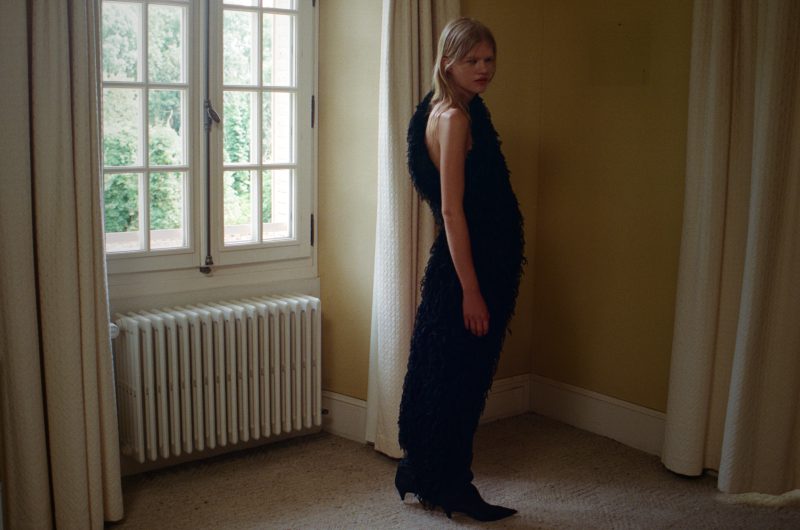
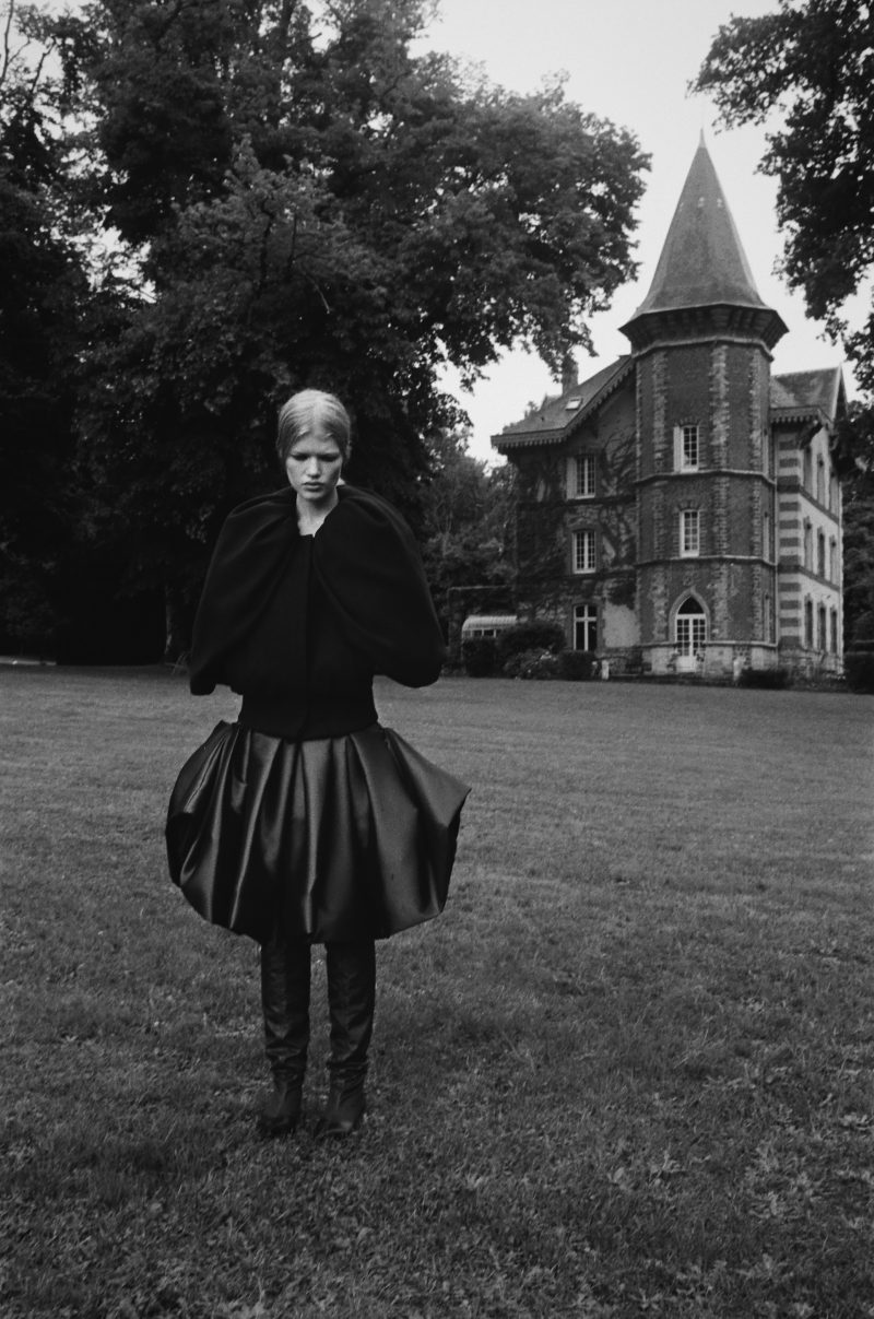
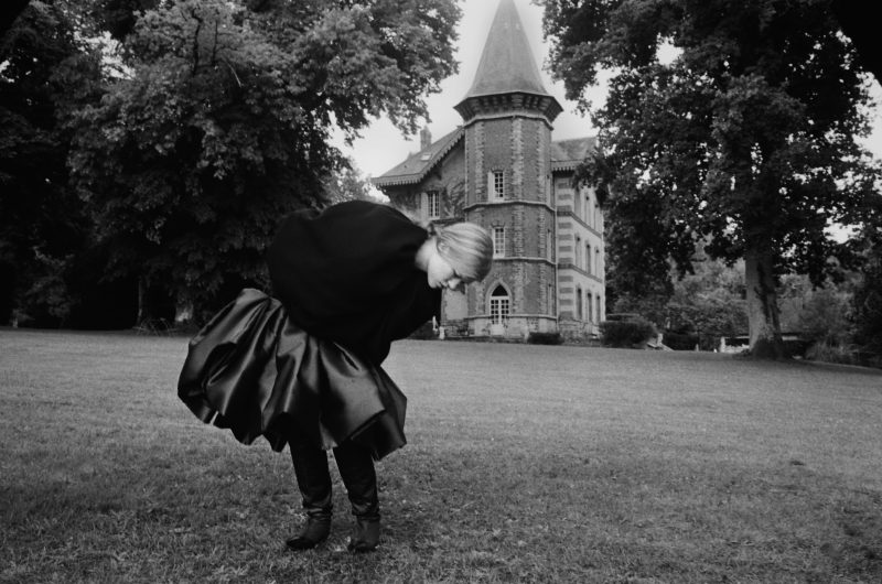
In Renaissance, interpreted through the lens of Kurt Lavastida, space is not just a backdrop, it is the protagonist. It is an integral part of the characters and the story. The space allows the audience to understand and empathise with the model. Environments that let suffering emerge: closed, oppressive, cramped spaces, and others that are spacious, airy, perhaps even liberating. This alternation is fundamental, making visible the contrast between oppression and inner respite.
The model contributes powerfully to this message with evocative, sometimes material poses. Her arms are crossed, mouth muffled by the mattres and postures that speak of conflict, silence, internal screaming. The locations range from a house, with its four walls, off a large garden, which however always has the house in the background. The house is a place of constraint, almost claustrophobic, while the garden, despite its constant proximity to the house, offers air, a calm that reassures but does not erase the weight.
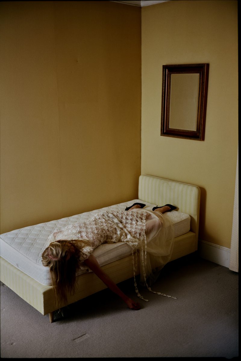
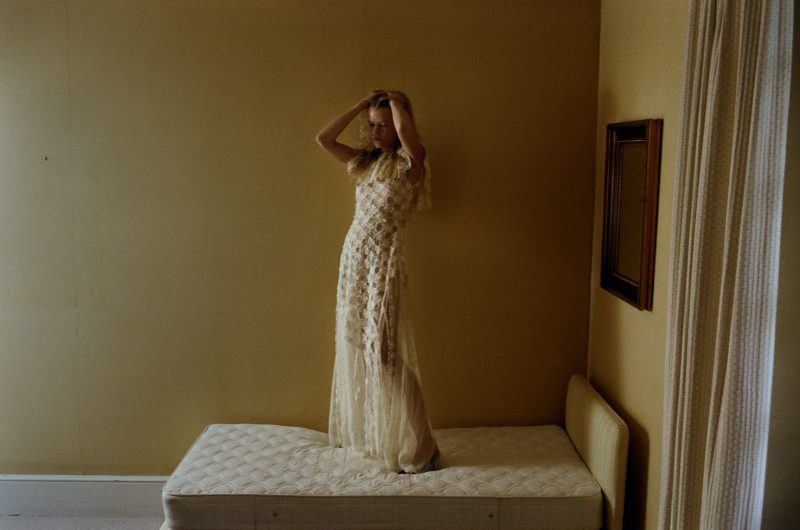
The most contemplative shot depicts the protagonist in a small, cramped room dominated by a bed and a picture frame, both of which fill the space. The lighting is yellow and warm, but the feeling it evokes is anything but warm. The model is lying on the bed, face down, one arm dangling. It serves as a portrait of profound loss, even if not explicit. In this slowness, in this pose that evokes death. Just as in Munch’s paintings, the heaviness is present, sometimes barely suggested, never striking but inexorable.
The inspiration linked to Munch does not end with this suspended atmosphere, but extends to the choice of colours in the shots. Warm, soft and slightly saturated tones. Yellows and greens dominate, giving the project an uncomfortable feel. It does not feel bright, not even reassuring, but rather unstable, ambivalent, emotionally charged. Just as in the artist’s paintings, colours such as yellow, green and red are not chosen for decoration, but for their emotional charge. Yellow can be bright or sickly, green can evoke nature, but also nausea, red can be passion but also blood, pain. The shades are often soft, muted, as if they were dull or veiled in sadness.
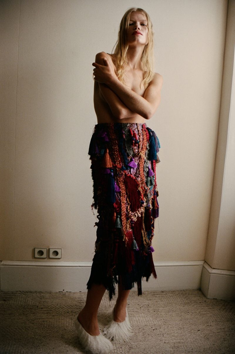
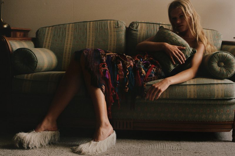
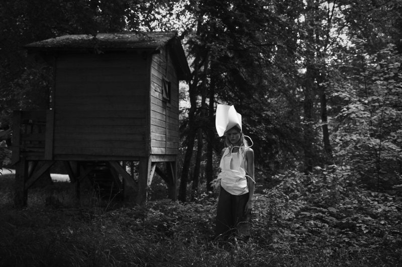
Veronica Blagoeva’s styling plays a key role mirroring the protagonist’s emotions. It does not go unnoticed. Rich in texture and different colours, it seems like a spectrum of moods and feelings. The shapes are eccentric, they seem to change, leaving room for the viewer’s imagination. So the audience is invited to enter the protagonist’s mind, to perceive what she feels, not just observe what appears. Among the brands used are Dior, Dries Van Noten, and Rochas. Brands that, with their fabrics and cuts, bring an extra dimension of visibility and concreteness to the representation. The fabric becomes skin, the drape becomes an emotional body.
Renaissance is not just a series of photographs, but a visual experience that transforms inner feelings into space, movement and colour. It invites us to pause, look and feel together with those who pose. The project demonstrates how emotions can become concrete matter and reminds us that even in the angel of death there can be beauty.