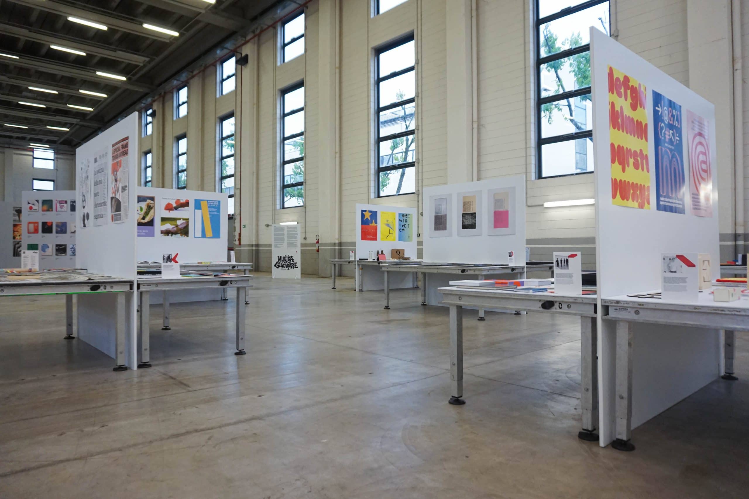
In 1997, curator Catherine David titled the tenth edition of documenta – the contemporary art fair held every five years in Kassel, Germany – “Politics Poetics”, meaning that we can talk about politics poetically, but also that politics itself is already poetic. This quote immediately crossed my mind when I heard Francesco Dondina discussing BIG – Biennale Internazionale Grafica, a decentralised festival of communication design, which first edition took place in various locations in Milan, with the ADI Design Museum and the Certosa District as its main hubs. The Biennale Internazionale Grafica brought together two souls: the first is to be a compendium of everything that has happened and is happening internationally in the field of communication design, but the second – and most important – is to highlight how communication design not only could have, but already does have, a strong impact on social and political life. How so? What is ethical graphic design? And when can politics become communication design poetics?
Alessia Baranello: No theme but many attitudes and many missions, with a strong programmatic tension. In this sense, BIG is quite different from other Italian fairs dealing with communication design or product design. What did you want to do differently with this biennial event?
Francesco Dondina: Big is as transversal and fluid as contemporary society and the disciplinary world we refer to. As of today, it is difficult to define communication design (which is nothing but the visual expression of design in the broadest sense) according to traditional frameworks. I would like the public to start perceiving design in its anthropological dimension by bringing the focus back to people’s needs and less to objects or artifacts. I am annoyed by design fairs that chase fashions or market impulses, I would like to see a return to a less superficial look. We are not on Tik Tok or Instagram, we are in the real world, a world of relationships, connections and possibly reflections on what is happening around us to try to understand where we are and where we are going.
AB: In the press release accompanying BIG’s events you emphasise that – sure – “there is professional design practice, but there is also ethical design, a design aimed at the social and political sphere, a design that addresses the community”. When reflecting on the social history of design for this interview, I immediately thought of Enzo Mari and other product design exponents of the militant Italian Seventies. But very little comes to my mind in terms of militant communication design. Could you tell us more about this struggling, fighting, committed communication design?
FD: In 1964, Ken Garland (British graphic designer, photographer and writer) published a programmatic manifesto entitled “First Things First” that was signed by more than 400 graphic designers and artists. This was an extraordinary initiative taken against the mass consumerist culture of the 1960s and against the pervasive and unscrupulous language of commercial advertisements. In Italy between the 1970s and 1980s there was a fairly unique experience that came to be called “Grafica di Pubblica Utilità” (Public Utility Graphics) which sanctioned the virtuous relationship between designers and local public administrations to raise citizen awareness regarding issues of common interest such as the environment, healthcare, public safety, and transportation. Among the protagonists of this experience, I remember Albe Steiner, the undisputed father of Italian graphic design, who, in 1970, with his students from the Urbino School of Arts, put together a visual identity and urban signage project that is still remembered today as an unbeatable example of public graphic design. But again, among others exponents of this ethical design, I want to mention: Mario Cresci, Massimo Dolcini, Gianni Sassi, Giovanni Anceschi. Even the very signage designed by Bob Noorda in the early 1960s is an example of design aimed at the citizen’s needs in mobility and transportation.
AB: To conclude, do you think that in Italy – apart from professionals – there is a more or less widespread awareness among the public of the political and social importance of communication design and visual cultures?
FD: Absolutely not. It is already difficult to explain to Visual Design students why we exist and what we do as professionals, but – more than anything – what we designers should do in terms of social responsibility. Let alone if the public is aware of this. Everyone talks about sustainability, but few know what it really means, especially companies, institutions and their representatives. Sustainability has a lot to do with the practical and concrete impact that our choices and actions have on people and on the environment. I’ll give you some concrete examples: If you design audiobook app interfaces with fluorescent colours and cool but unreadable fonts, you have not considered that the primary users of audiobooks are visually impaired people. If you design directional signage with fashionable graphics but which is ineffective from the point of view of visual clarity, you are doing styling not design. Before you teach students and people what design is, you have to teach what design is for. Massimo Vignelli believed that a designer’s main mission is to educate his or her clients or stakeholders about good design. I always considered this statement a bit presumptuous but today I think Vignelli was right.
AB: The first exhibition within BIG’s program that comes to my mind when I think of communication design for the community is the Bob Noorda’s retrospective, which you curated with Catharin Noorda. In the title you refer to him as a “metropolitan graphic designer”, what do you mean by that?
FD: The exhibition dedicated to Bob Noorda is a small installation focused on his design of the graphics for Milan’s subway. We conceived it as a fitting tribute to a work known worldwide for its seriousness and rigor, and which turns sixty years old this year. Noorda was an extraordinary designer and man whom young people should continue to study. His main peculiarity was that he always thought from the perspective of the user and the citizens: he conceived design – and particularly visual design – as a service to the public. You will never find a Noorda design that succumbs to aesthetic pleasure for its own sake. Today, if we told the millions of young designers scattered around the world about this attitude, they would smile sarcastically at the very least. As of today, contemporary design is, in most cases, self-referential and hyperformal and, above all, Instagram-friendly. The subtitle “metropolitan graphic designer” that we choose for the exhibition refers primarily to the design of Line 1 but winks at the role Noorda has played on an urban scale and particularly in the city of Milan. Although Dutch-born, he always considered himself a Milanese, and I will expand more on that in a talk held at ADI Design Museum on Sunday, May 26, at 10:30 a.m. He left so much in Milan, and our streets are still filled with his graphic signs such as the Mondadori, Feltrinelli, Coop, and Banco Desio brand logos. Who can boast of such a record? Bob Noorda was a metropolitan and Milanese graphic designer; in fact, it is no coincidence that he rests in the Famedio of Cimitero Monumentale in Milan.
AB: Another exhibition in the program that intrigued me is the one dedicated to Ilio Negri. The exhibition “NO alla civiltà sé questa è civiltà” (NO to civilisation if this is civilisation), curated by Luca Negri, features thirteen posters created by the designer for the 1970 Rimini Biennial. Why did you feel the need to exhibit this very body of his work?
FD: Ilio Negri was one of the great protagonists of the golden age of Italian graphic design and one of the representatives of the group that came to be known as the “Milanese School” between the 1950s and 1970s. He was born in 1926 and died prematurely in 1974. As a young man he studied economics at Bocconi but had to interrupt his studies to take care of the family printing house. A friend since childhood of Giulio Confalonieri – another giant of Italian graphic design – he founded Studio Confalonieri Negri with him. Among their clients: Pirelli, Boffi, Cassina, Innocenti. Around the mid-1960s he extended his association with two other masters, Pino Tovaglia and Michele Provinciali (Studio CNPT), however the group was short-lived. With Aldo Novarese he designed the Forma typeface for the Nebbiolo foundry. He died at only 48 years old and left three children: Paolo, an architect, Luca, a graphic designer and Silvia, a PR officer. It is together with Ilio’s three children that we decided to dedicate a tribute to him as part of BIG and to showcase the project NO alla civiltà sé questa è civiltà because we felt it was still a very relevant message to dedicate to younger generations.
AB: Sorrows in Graphic Design is an exhibition curated by Maurizio Milani, which collects all those projects from the history of design that did not work, that the client rejected or that – for some other reason – remained incomplete. Above all, I think this exhibition ironically emphasises an aspect dear to Italian design: that synergy between designers and enlightened entrepreneurs which, especially at the end of the last century, gifted us with ironic, utopian and sometimes even polemical design projects. What works does this exhibition bring together?
FD: Sorrows in Graphic Design is a divertissement, a kind of Salon de refusés of graphic design. In the history of Italian graphic design, the most emblematic example of a work rejected by the client is the Milan subway brand logo, the one with the two mirrored M’s above and below, designed by Bob Noorda for the brand’s visual identity and signage project for Line 1, which we have already mentioned. The logo was presented to the management of Metropolitane Milanesi – a board composed mostly of engineers – and, when the president rejected the idea, everyone else followed him. With irony and levity, Maurizio Milani invited a group of designers to present their best work “bounced” from brand commissions for various reasons. Among the guests: Cristina Chiappini, Studio FM Milano, Massimo Pitis, Susanna Vallebona, Alain Dequernec, Mario Piazza.